Conducting a Solid UX Competitive Analysis

“Competition brings out the best in products
and the worst in people.” –  David Sarnoff

Most people are familiar with the concept of a competitive analysis; it’s a fairly standard business term to describe identifying and evaluating your competition in the marketplace. In the case of UXD, a competitive analysis is used to evaluate how a given product’s competition stacks up against usability standards and overall user experience.  A comparative analysis is a term I’ve often used to describe the review of applications or website that are not in direct competition with a product, but may have similar processes or interface elements that are worth reviewing.

Often, when a competitive review is conducted, the applications or websites are reviewed against a set of fairly standard usability principles (or heuristics) such as layout consistency, grouping of common tasks, link affordance, etc. Sometimes, however, the criteria can be more broadly defined to include highlights of interesting interaction models, notable functionality and/or other items that might be useful in the context of the product being designed and/or goals of a specific release.

The Expert Review
Competitive reviews can be done in conjunction with an “expert” review which is a usability evaluation of the existing product. If doing both a competitive and expert review, it’s helpful to start out with the competitive review and then conduct the expert review using the same criteria. Completing the competitive review first allows you to judge your own product relative to your competition.

Why Conduct a Competitive Analysis?

  • Understand how the major competition in your space is handling usability
  • Understand where your product stands in reference to its competition
  • Idea generation on how to solve various usability issues
  • Get an idea of what it might take to gain a competitive edge via usability/UX
  • If a thorough competitive review has never been conducted.
  • When a new product, or major game-changing rebuild is being considered.
  • Annually or bi-Annually to keep an eye on trends in your industry and on the web (such as changes in how social networking sites are integrated)

When is a Competitive Analysis Most Useful?

Competitive analysis is best done during early planning and requirements gathering stages. It can be conducted independent from a specific project cycle, or if used with a more focused criteria, it can help with the goals for a specific release.

Limitations of a Competitive Analysis

  • A competitive analysis can help you understand what it will take to come up to par with your competitors; however, it cannot show you how you can innovate and lead.
  • Insights can be limited by the knowledge level and/or evaluation abilities of the reviewer.
  • They can be time consuming to conduct and need to be re-done on a regular basis.

How to Conduct a UXD Competitive Analysis

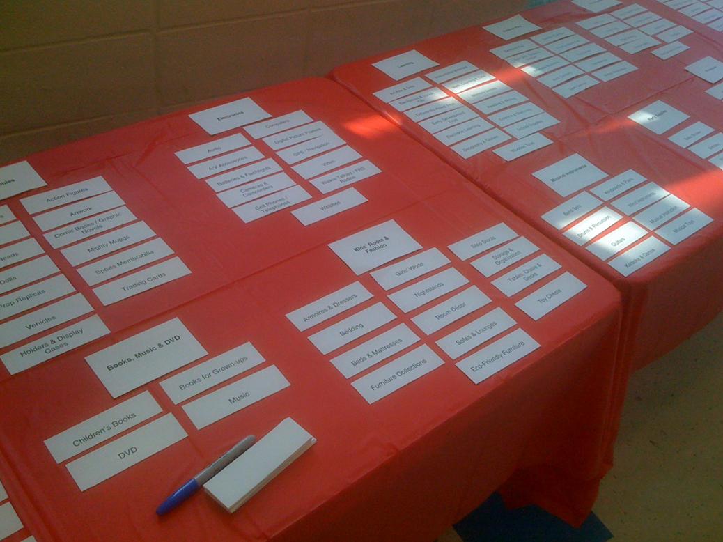
  1. Select your competition. On average, I would recommend to target no less than five, but no more than ten of your top competitors. The longer the competitive list is, the more difficult it will be to do a sufficiently thorough investigation. In addition, there becomes a point of diminishing returns where there is not much new going on in the space that hasn’t already been brought to light by a previous competitor.
  2.  
    Consider this…

    When selecting a list of competitors, instead of just asking, who does what we do? Think about user’s alternatives. Ask, who or what is mostly likely to keep users from using our software or going to our website? While not normally thought of as “competition”, alternatives for an operations support system could be an excel spreadsheet or printed paper forms.

  3. Define the assessment criteria. It is important to define your criteria before you get started to be sure you are consistent in what you look for during your reviews. Take a moment to consider some of the issues and goals your organization is dealing with and some hypotheses you uncovered during your audit and try to incorporate these into the criteria as possible. Criteria should be specific and assessable. Here is a short excerpt of a criteria used in an e-commerce site evaluation:
    i.    Customer reviews and ratings?
    ii.    Can you wish list your items to refer back to later?
    iii.    In-store pickup option?
    iv.    Product availability indication?
    v.    Can you compare other items against each other?
    vi. What general shopping features are available?
  4. Create a Spreadsheet. Put your entire assessment criteria list in the first column, and the names of your competition along the top header row. Be sure to leave a general comments line at the bottom of your criteria list; you will use this for notes during individual reviews. Some of the evaluation might be relative (i.e. rate quality of imagery relative to other sites 1-10), so it is particularly helpful to have one spreadsheet as you work through each of your reviews.
  5. Gather your materials. Collect the competitive site URLs, software, or devices that you will be reviewing so they will be readily available.  A browser with tabbed browsing works great for web reviews. A tip for a mobile device application is that often simulators can be downloaded that allow you to display the mobile device software on your computer.
  6. Start Reviewing. One at a time, go down the criteria list while looking through the application and enter your responses. It can be helpful to use a double screen with the application on one view and the spreadsheet on the other. Take your time and try to be as observant as possible; you are looking for both good and bad points to report. As you review, write down notes on what you liked, what annoyed you and any interesting widgets you see. Take screen captures of interesting or relevant screens as you do each review.
  7. Prepare the Analysis. Create an outline of the review document including a summary area and a section for each individual review. Paste the assessment results and your notes from the spreadsheet into the document and use as a starting point for writing the report. You may need to grab additional screen captures of specific things that will be in your evaluation.
  8. Summarize your Insights. Now that you have the reviews done, you can look back what data pops out as most relevant. Some of the criteria results can be translated into summary charts and graphs to better illustrate the information.
  9. Schedule a Read Out. Take time to present your findings, setup a read-out for your colleagues. You may want to create a very high-level power point presentation of some of the more interesting point’s from your review. After conducting the read-out, publish your documentation and let people know where you’ve placed the information.

Competitive Assessment Rubric

If you don’t have time for a full written competitive analysis, you can evaluate your competition with an assessment rubric.  Because it results in a clear ranking, the rubric is a good “at a glance” way of communicating a software’s relative strengths and weaknesses to clients. Some things to note about this evaluation method:

  • It is not a scientific analysis; it’s a short-cut for communicating your assessment of the systems reviewed. Like judging a talent competition, subjective ratings (i.e. “eight out of 10”) are inherently imprecise. However, if you use consistent, pre-defined criteria you should end up with a realistic representation of your comparative rankings.
  • When creating the assessment criteria it is important to select attributes that are roughly equivalent in value. In the example below, “Template Layouts” and “Browsing & Navigation” were equally important to the overall effectiveness of the sites reviewed.

The following rubric was created to evaluate mobile phone activation sites, but this approach can be adapted to create ranking metrics for any application.

1. First, create the criteria and rating system by which you will evaluate each system.

1 – Poor 2 – Average 3 – Excellent
Marketing Commerce Integration Option to “Buy Now” is not offered in marketing pages or users are sent to a third party site. The option to “Buy Now” is available from the marketing pages but there are some usability issues with layout and transition The marketing and commerce sites are well integrated and provide users with an almost seamless transition
Template Layouts (Commerce) The basic layout is not consistent from page to page and/or the activity areas within the layout are not clearly grouped by type of user task. The layout is mostly consistent from page to page and major activity areas are grouped by task type. Some areas with information heavy content or more complex user tasks deviate from the established layout paradigms. The site shows a high level of continuity both in page to page transitions and task-type groupings. Information heavy content and complex user tasks are well thought out and intuitive relative to the site’s established layout paradigms.
Browsing & Navigation The site lacks a cohesive Information Architecture. Information is not in a clear top-down hierarchy. There are numerous “orphan” or pop-up pages that do not fit within the site structure. Similar content is duplicated in multiple areas or is presented in multiple navigational contexts. The site has a structured Information Architecture. Secondary and Tertiary navigation items are related to parent elements, but there may be multiple menus unrelated to the broader structure. There may be orphan pages of detail or less relevant information. The Information Architecture is highly cohesive. Information is structured with a clear understanding of user goals. Everything has a logical place within the architecture; secondary menus are incorporated into the site structure or clearly transitioned.
Terminology & Labeling (Commerce) Terminology and labeling is inconsistent, confusing, or inaccurate. Different terms are used to represent the same concept. Some terms may not adhere to a common understanding of their meanings. Terminology and labeling is consistent but could be more intuitive. Some unnecessary industry specific terminology or uncommon terms are used. Terminology and naming is both intuitive and consistent. Only necessary industry specific terminology is used, in context, with help references.

2.    Next, evaluate the competition along with your own system, scoring the results.

  • Marketing & Commerce Integration: how well the site handled the user’s transition from browsing product information to after making an online purchase decision.
  • Template Layouts: how clear and consistent the overall layout is and how well the layout elements translate to different areas of the site.
  • Browsing & Navigation: relative clarity and consistency of the information architecture and overall ease of browsing.
  • Terminology & Labeling: relative clarity and consistency of the language use and element naming.


Marketing & Commerce Integration Template Layouts Browsing & Navigation Terminology & Labeling

Total

Our System

2 (Average)

1 (Poor)

2 (Average)

3 (Excellent)

8

Company A

3

3

2

3

11

Company B

2

2

2

2

8

Company C

1

3

1

2

7

Company D

2

3

2

3

10

Company E

3

Company F
Company G
Company H


3.    Once your table is complete, you can sort on the totals to see your rough rankings.

How to Develop Basic User Personas

“Before I can walk in another person’s shoes,
I must first remove my own.” – Brian Tracy

This article discusses the basics for developing of a set of user personas. User personas are not a research method, but a communication tool. They are a visual, creative way to convey the results of research about the users of your software or website. Personas are fictional characters developed to represent aggregate statistical averages to profile a user group. They do not express all types of user or their concerns, but can give a reasonable representation of who might be using your product and what some of their goals or issues might be. Personas are not fixed precise definitions of your users; they are more of an empathy creating tool. They can help you get into the mindset of a user type and communicate that mindset to others.

One created, personas are a way of humanizing your users and providing a canvas on which you can superimpose ideas on how a given user type might interact with your system. A little bit like criminal profiling (minus the crime and vilification), you can think of it as role playing with the intention of gaining new insights into the other party. User Personas should not be confused with engineering use cases or marketing demographic profiling.

Why develop user personas?

  • A key benefit to developing user personas is to provide user-centric objectivity during product design, and reinforce the idea that you and your colleagues’ version of a great user experience is not necessarily the same as your end users.
  • User Personas can dispel common stereotypes about users, e.g., the site needs to be so easy to use the VP’s grandmother can use it.
  • Later in the design process, user personas can help you communicate the usefulness of a specific design to stakeholders.

While I used to be somewhat limited in using persona, I did create them a few years ago for a top-five business school. The project was in the context of a site redesign that included an overhaul of the site’s information architecture. I conducted a fairly exhaustive audit of the MBA space which included a competitive review, expert review, and stakeholder interviews. At the time, I didn’t create personas for myself, I just used the underlying audit data to restructure the site’s content and define a simplified navigational model. However, later, when preparing to present the new information architecture to the client, I took the time to create a set of user personas based on the original data I used to make my design decisions. They were created out of a need to help illustrate to the client how the new structure better addressed the needs of their prospective students, and to assure them that user’s concerns were being addressed. After realizing how effective persona can be for stakeholder buy-in and alignment I have since used them much more frequently in a range of UX projects.

When are personas most useful?

  • User personas are useful when there are a number of unsubstantiated assumptions floating around about who your users are. E.g. early adopters, soccer moms, the VP’s grandma, etc.
  • When there is a tendency for developers and product managers to make design decisions based on; their own personal preferences, technical constraints, chasing short term sales, or any other reasoning that does not consider the end user.
  • When there is a general lack of clarity about who your end user is, or when the data you have regarding your users does not seem to directly translate into insights about their behavior.
  • Whenever you need a communication tool to advocate and encourage empathy for end users.

Development Lifecycle

Persona creation is best done during requirements gathering stage. However, getting the most out of your user personas means that they should also be referenced during development and testing, as questions and changes arise. They should also be compared to, and updated against actual user testing and post-release feedback. If properly evolved and maintained, personas can be an effective guidepost throughout the development and product lifecycle.

Limitations of User Personas

  • It’s easy for personas to be taken too literally or become a stereotype. Personas should never be considered a definitive archetype of your users, doing so runs the risk of turning your definitions into pseudoscience, akin to phrenology. Direct user testing and feedback insights should take precedence over anything user persona derived.
  • User personas are not precise; they are limited by the innate prejudices, interpretations, and reference points of the authors of the personas and any subsequent user scenarios.
  • User personas are not an appropriate communication tool for everyone; some people prefer a well crafted presentation of the source data over a persona which can be perceived as containing superfluous data.

How to implement user personas

With a little research, a set of basic personas is actually fairly easy to put together. The first step is to pull research from multiple sources to gather data about potential users. Next, synthesize this data to form user groups and select representative data from each user group to form a user data profile. Finally, add supplemental character information to create a believable persona. As a general rule, you should start with trying to define three to five user types, adding additional types as appropriate. I would recommend against defining more than about eight or 10. Beyond this number, you start to exceed people’s ability to reasonably keep track of the information.

Consider This…

If you think you need more than ten personas, or have already been heavily relying on personas to drive development consider as a next step investing in an ethnographic study. Real profiles and insights derived from the results of an ethnographic study will provide more actuality than fictitious personas.

  1. Conduct Research. Pull together any reliable data you can find might describe your users or give insight into their goals, concerns or behaviors. Collect any potentially relevant demographics such as; gender, age, race, occupation, household income. Let’s, for example, take the case of developing personas around prospective MBA students. In addition to client interviews I was able to pull a large amount of key data from sources on the Internet. Some references I found were:
    • Graduate Management Admissions Council
    • GMAC: 2004 mba.com Registrants Survey
    • The Black Collegian: ‘The MBA: An Opportunity For Change’
    • The Princeton Review: ‘Study of Women MBAs’
    • National Center for Education Statistics (NCES)
  2. Form Relevant User Groups. To continue with the business school case study, research on MBA students showed that there were a growing number of minority women enrolling in MBA schools. In addition, the client indicated a desire to further attract this type of student. Armed with that initial seed data, I defined a user group of minority women who were considering, had applied to, or attended business school. Further research allowed me to compile a list of statistical information about this group (such as average age, current occupation, family status, etc) as well as formulate some ideas about their interests, concerns and expectations. When compared to more “traditional” MBA students, these women were; a few years older on average, more likely to be married with children, and were highly-focused on what specific opportunities this type of degree offered post graduation.
  3. Create and Embellish the Persona. Start by turning the data you have for the user group into a single individual. The “Minority Women” user group was converted into a thirty six year old, African American woman named Christine. At this point it’s ok and actually preferable to fill in the gaps with plausible details about this person to bring them to life a bit; e.g. “Christine Barnhart is a marketing communications manager who balances her time between work and family…” Since this is in large part a tool to facilitate empathy for the user group, as much realistic information as possible should be incorporated to develop the character. As long as the “filler” is not negated by other data it should be fine.  Even still, after you have finished writing your personae take a step back and ask yourself; “Is it reasonable to expect this person to exist?” Alter your description if necessary, or move on to the next persona.
  4. Develop and Test User Scenarios. Now that you have your personas and an idea of what your user types are, we can make some assumptions about what functionality or information they might find useful. You will need to develop some User Scenarios to help test any hypothesis you have. Unlike a use case, which is a description of how system functionality interacts (i.e. contact data is retrieved, error message is returned), user scenarios focus on the user’s perspective. A simplified User Scenario for our “Christine” persona might look like:
    • While successful in her career, Christine is not entirely sure she has the background and experience to be admitted to a top business school. In addition, she has a lot of specific questions about the program’s culture. She is concerned that it may be too aggressively competitive for her to get the most out of her business school experience.Christine goes to the program website and immediate looks at the eligibility and admission requirements. She takes her time looking through the information and prints out a few pages. Next, she starts to browse around through site, trying to get a feel for the culture. She finds a section that has video interviews with students and so she watches a few and begins to get a sense of whether this school is a fit for her or not.

User Stories Not to be interchanged with a user scenario (or use case), a user story is a short two or three sentence statement of a customer requirement. It is customer-centered way of eliciting and processing system requirements within Agile development methodologies[1].

Basic Persona Template

There are a wide range of user persona templates, and they can get rather complicated. Considering that the intention of this type of tool is effective communication, I tend to gravitate toward the clean, simple layouts that are one page or screen. Below is a basic example template. Don’t get too focused on templates however, if you find information that you think is useful or relevant but it doesn’t fit your template, rework the template to fit the data.

Persona Layout - Template


[1] More information on user stories can be found at: http://www.extremeprogramming.org/rules/userstories.html

Card Sorting: A Primer

Change your language and you change your thoughts.” –  Karl Albrecht

Card sorting is a specialized type of user test that is useful for assessing how people group related concepts and what common terminology they use.  At its simplest form, a card sort is the processes of writing the name of each item you want to test on a card, giving the cards to a user and asking him or her to group like items into piles. There are however, a number of advanced options and different types of card sorting techniques.

Open Card Sort – An “open” card sort is when you do not provide users with an initial structure. Users are given a stack of index cards, each with the name of an item or piece of content written on it. They are then asked to sort through and group the cards, putting them into piles of like-items on a table. Users are then asked to categorize each of the piles with the name that they think best represents that group/pile. Open card sorts are usually conducted early on in the design process because it tends to generate a large amount of wide ranging information about naming and categorization.

Given the high burden on participants and researchers, I personally find an open card sort to be the least attractive method for most contexts. It is, however, the most unbiased approach. As a general rule, I would reserve this method for testing users with a high degree of expertise in the area being evaluated, or for large scale exploratory studies when other methods have already been exhausted.

Closed Card Sort – The opposite of an open sort, a “closed” card sort is when the user is provided with an initial structure. Users are presented with a set of predefined categories (usually on a table) and given a stack of index cards of items. They are then asked to sort through the cards and place each item into the most appropriate category. A closed sort is best used later in a design process. Strictly speaking, participants in a closed sort are not expected to change, add, or remove categories. However, unless the context of your study prevents it, I would recommend allowing participants to suggest changes and have a mechanism for capturing this information.

Reverse Card Sort – Can also be called a “seeded” card sort. Users find information in an existing structure, such as a full site map laid out on index cards on a table. Users are then asked to review the structure and suggest changes. They are asked to move the cards around and re-name the items as they see fit. A reverse card sort has the highest potential for bias; however, it’s still a relatively effective means of validating (or invalidating) a taxonomic structure. The best structures to use are ones that were defined by an information architect, or someone with a high degree of subject matter expertise.

Modified Delphi Card Sort (Lyn Paul 2003) – Based on the Delphi Research Method[1], which in simple terms refers to a research method where you ask a respondent to modify information left by a previous respondent.  The idea is that over multiple test cycles, information will evolve into a near consensus with only the most contentious items remaining. A Modified Delphi Card Sort is where an initial user is asked to complete a card sort (open, closed, or reverse), and each subsequent user is asked to modify the card sort of their predecessor. This process is repeated until there is minimal fluctuation, indicating a general consensus. One significant benefit of this approach is ease of analysis. The researcher is left with one   final site structure and notes about any issue areas.

Online Card Sort – As the name implies, this refers to a card sort conducted online with a card sorting application. An online card sort allows for the possibility of gathering quantitative data from a large number of users. Most card sorting tools facilitate analysis by aggregating data and highlighting trends.

Paper Card Sort – A paper sort is done in person, usually on standard index cards or sticky notes. Unlike an online sort, there is opportunity to interact with participants and gain further insight into why they are categorizing things as they are.

Why Use Card Sorting?

  • Card sorting is a relatively quick, low cost, and low tech method of getting input from users.
  • Card sorting can be used to test the efficacy of a given taxonomic structure for a Web site or application. While commonly used for website navigation, the method can be applied to understand data structures for standalone applications as well.
  • When designing new products or major redesign efforts.
  • When creating a filtered or faceted search solution, or evaluating content tags
  • For troubleshooting, when other data sources that indicates users might be having a hard time finding content.

When is Card Sorting Most Useful?

Development Life-cycle

Card sorts are useful in the requirements gathering and design stages. Depending on where you are in the design process you may get more or less value from a given method (open, closed, reverse, etc).

Limitations of Card Sorting

  • The results of card sorting can be difficult and time consuming to analyze; results are rarely definitive and can reveal more questions than answers.
  • The results of a card sort will not provide you with a final architecture; it will only give you insight possible direction and problem areas.

How to Conduct a Card Sort

Card sorts are one of those things that are somewhat easier to conduct than to explain. Because there are so many variations, I’ve decided to illustrate the concept with a walkthrough of an actual project case study. I was recently brought into a card sorting study by a colleague of mine[2] who was working on a complex taxonomy evaluation. The project was for a top toy retailer’s e-commerce site. After weeks of evaluating traffic-patterns and other data, my colleague had developed what he hoped would be an improved new site structure. He wanted to use card sorting techniques to validate and refine what he had developed.

  1. Define your research plan. Our research plan called for some online closed cards sorts to gather statistically relevant quantitative data, as well as the rather innovative idea to go to one of the retail locations and recruit shoppers to do card sorting onsite. The in-store tests would follow a reversed sort, using the modified Delphi method. I.e. Shoppers would be shown the full site structure and asked to make changes. Each shopper would build off of the modifications of the previous shopper until a reasonable consensus was achieved.
  2. Prepare your materials. In the case of in-store card sorts, we needed to take the newly defined top and second level navigation categories and put each on its own index card. The cards would be laid out on two long banquet tables so participants could see the structure in its entirety. Single page reference sheets of the starting navigation were printed up so we could take notes on each participant and track progressive changes. We had markers and blank index cards for modifications. A video camera would be used to record results, and a participant consent form was prepared.
  3. Recruit Participants. Unlike lab-based testing where you have to recruit participants in advance, the goal for the in-store testing was to directly approach shoppers. The idea was that not only would they be a highly targeted users group, but that we would be approaching them in a natural environment that closely approximated their mindset when on the e-commerce site i.e. shopping for toys. Because we would be asking shoppers to take about 10-20 minutes of their time, the client provided us with gift cards which we offered as an incentive/thank you. Recruitment was straightforward; we would approach shoppers, describe what we were doing and ask if they would like to participate. We attempted to screen for users who were familiar with the client’s website or at least had some online shopping experience.
  4. Conduct the Card Sort. After agreeing to participate and signing the consent form, we explained to the participant that the information on the table represented potential naming and structure for   content on the e-commerce site. Users were asked to look through the cards and call attention to anything they didn’t understand or things they would change. They could move items, rename them or even take them off the table. Initially we let the participant walk up and down the table looking at the cards. Some would immediately start editing the structure, while others we needed to encourage (while trying not to bias results) by asking them what they had come into the store for and where might they find that item, etc. After an initial pass, we would then point out to the participant some of the changes made by previous participants as well as describe any recurring patterns to elicit further opinions. After about 15 participants, the site structure stabilized and any grey areas were fairly clearly identified.
  5. Fig 3 Card Sort
     
    Figure 3: Sample Card Sort Display: Cut Index Cards on Table

  6. Prepare the Analysis. At the end of the study, there was a reference sheet with notes on each participant’s session, video of the full study, and a relatively stable final layout. With this data, it was fairly easy to identify a number of recurring themes, i.e. issues that stood out as confusing, contentious, or as a notable deviation from the original structure. As in any card sort, the results were not directly translatable to a final information structure. Rather, they provided insights that could be combined with other data (such as online sorting results) to create the final taxonomy.

Additional Resources


[1] The Delphi Research Method http://www.iit.edu/~it/delphi.html

[2] David Cooksey, Founder & Principal, saturdave, Philadelphia, PA