Case Study: Redesigning Job Budget Allocation for Indeed’s Enterprise Employers

How do you increase user trust in an automated system they don’t understand?

Indeed Enterprise was facing a growing problem. Employer clients were increasingly frustrated with the lack of transparency in a recently implemented automated payment allocation algorithm. The behind-the-scenes process distributed funds to job postings based on market conditions and other metrics. While well-intended to help employers maximize the value of Indeed’s advanced job market advertising model, users didn’t trust the system. Many employers bypassed the algorithm entirely, manually allocating funds per job, which led to inefficiencies, misaligned priorities, and mounting dissatisfaction.

As Senior UX Researcher, I led research for a redesign initiative to address these concerns, focusing on creating a more transparent, user-centered solution. Through in-depth user research and iterative prototyping, we developed a system that empowered employers with greater control over job postings’ budget allocation. The new solution not only increased user engagement and trust in the algorithm, but also shaped the product roadmap for future enterprise clients.

Results Snapshot:

  • Higher User Engagement: Clients who adopted the new workflow reported greater confidence and efficiency in managing job priorities and budget allocation, resulting in better overall platform satisfaction.
  • Increased Trust in Algorithm: The added transparency and control features significantly improved trust in the automated system, leading to higher adoption rates.
  • Strategic Product Influence: The success of this project directly shaped the future direction of Enterprise product strategy, influencing key roadmap decisions.
  • Model for User-Centered Design: The initiative was widely recognized internally as a benchmark for applying user-centered design principles, setting a new standard for the organization.

Looking for more insights? Use this download form to access my collection of detailed case studies, showcasing impactful results across industries. Discover how I’ve tackled complex challenges with innovative solutions.

Case Study: Enhancing Wawa’s Self Serve Kiosk for New Dinner Options

How can Wawa introduce new dinner options while ensuring an intuitive, high-quality ordering experience for customers in both established and new markets?

As Wawa expanded into new markets and introduced a dinner menu, the company faced unique challenges: maintaining their reputation for high-quality, made-to-order food, and overcoming the negative connotations associated with traditional gas station fare. Additionally, Wawa needed to enhance the functionality of their self-serve kiosks and mobile app to support these new dinner options, while making the ordering experience smoother and more intuitive for users.

I was engaged as a UX Research Consultant, drawing on my expertise in customer research and menu taxonomy to help Wawa tackle these issues. Our goal was to refine the kiosk and mobile app experience, using qualitative and quantitative methods to gather insights into customer behavior, and ultimately improve both satisfaction and order completion rates.

Results Snapshot

  • Optimized Menu Taxonomy: Streamlined the ordering process by revising the dinner menu structure and improving overall navigation.
  • Improved User Satisfaction: Real user feedback drove enhancements that boosted customer satisfaction with the kiosk and mobile app experience.
  • Actionable Insights: Delivered key findings on user preferences, helping Wawa introduce new offerings while maintaining brand consistency across markets.

Looking for more insights? Use this download form to access my collection of detailed case studies, showcasing impactful results across industries. Discover how I’ve tackled complex challenges with innovative solutions.

Case Study: Streamlining Carton Tracking Workflows for Enhanced Efficiency

How do you transform a legacy logistics system into an efficient, user-centered platform without major infrastructure overhauls?

PCSTrac, a carton tracking solution for online retailers, had proven its value in core functionality but was hindered by a cumbersome user interface and workflow inefficiencies. Although technically robust, users often relied on time-consuming workarounds that slowed down operations. My role was to collaborate with senior engineers to bring a user-centered perspective, aligning design improvements with the existing technical constraints of the legacy platform.

Through contextual inquiries, persona development, and usability testing, I led the research that informed both workflow optimizations and interface redesigns. The project resulted in more streamlined processes that significantly improved user satisfaction and system usability. Additionally, the PCSTrac team embraced user-centered design principles, applying these to future product development.

Results Snapshot:

Balanced Technical Constraints and User Needs: Despite the limitations of the legacy system, the user-centered design approach introduced practical solutions that enhanced the user experience without necessitating expensive system overhauls.

Increased Efficiency through Streamlined Workflows: By addressing key workflow bottlenecks, the system allowed users to eliminate redundant manual processes, leading to measurable improvements in operational productivity within 3PL operations.

Improved User Satisfaction and Task Efficiency: The redesigned interface, with a cleaner and more intuitive layout, led to increased satisfaction among users who had previously been frustrated by the outdated interface. This improvement enhanced task efficiency and reduced friction in daily operations.


Looking for more insights? Use this download form to access my collection of detailed case studies, showcasing impactful results across industries. Discover how I’ve tackled complex challenges with innovative solutions.

Case Study: Uncovering New User Segments for Comcast’s WiFi On Demand Service

How did unexpected user insights help Comcast re-engage customers and improve product workflows?

Comcast’s WiFi On Demand service experienced unexpected growth among various user demographics, including low-income users and former subscribers. Originally designed for business travelers, our research revealed that many users viewed the service as an alternative to traditional home internet, especially during life transitions. These insights provided Comcast with an opportunity to re-engage these customers with targeted payment plans, as well as enhance the product’s application interface to address key pain points and workflow inefficiencies.

Through buyer interviews, personas, user journey mapping, and surveys, I led a comprehensive research effort to understand these diverse behaviors and pain points. This informed strategies to re-engage key user segments and improve the interface design, ultimately increasing recurring pass purchases and expanding the service’s reach across underserved demographics.

Results Snapshot:

  • Re-engaged Former Customers: Comcast developed targeted re-engagement strategies for lapsed customers who had switched to daily passes due to overdue bills. This included customized payment plans aimed at bringing them back into monthly subscription services.
  • Enhanced Workflow and UI Efficiency: Direct improvements to the product’s user interface and workflow design were made based on the pain points identified during user research. These changes optimized the service’s overall usability and reduced friction in the ordering process.
  • Increased Revenue from Underserved Demographics: Insights revealed untapped customer segments, leading to increased recurring pass purchases from previously overlooked user groups, including recent movers and transient users.

Looking for more insights? Use this download form to access my collection of detailed case studies, showcasing impactful results across industries. Discover how I’ve tackled complex challenges with innovative solutions.

Moving from Vision to Design: User-Centered Methods for New Product Definition

Seminar by Dorothy M. Danforth for the IEEE Computer Society Leading Professional Seminar Series. – 30 minutes

https://www.youtube.com/watch?v=JnymRBYY1vQ&feature=youtu.be

It’s a common scenario: A company is planning a new product or significant redesign. There have been various discussions about how the product should have a “great user experience” and “focus on the user.” But, there are also conflicting ideas on what a great experience might entail, along with competing priorities for what the product absolutely must do to be successful in the marketplace. ​

Where to begin? How do you break through the confusion and move towards a clarified product vision? Whether a large established corporation or lean start-up, organizations struggle with progressing from early ideation into clear requirements and a tangible design phase. This webinar will explore ways to leverage user experience design methods in the very early stages of the product life cycle.

This session covers the following:

  • An overview of practical user research and design planning methods useful for early stage products and redesigns
  • Strategies for leveraging these methods to refine a product’s vision and ensure features are tied to user goals
  • Examples of how keeping a focused eye on user needs can help resolve conflicting priorities and promote product team alignment

Conducting a User Experience Audit

“If you would understand anything, observe its
beginning and its development.”
– Aristotle

A User Experience (UX) Audit is a secondary research method that pulls together any potentially relevant existing information on your software product and it’s market, and then reviews what you find in the context of your design goals. It’s a straightforward approach I’ve use in just about every strategy project I’ve completed for clients.

This article is intended to illustrate the type of data commonly available that can be helpful. It is by no means an exhaustive list, but should be enough to point you in the right direction. I recommend starting any strategic effort with this approach because it is vital to have a baseline understanding of the market landscape before learning more about the users within that market. In addition, much of the information and insights gleaned from this type of evaluation can be used to directly inform other user research methods, such as persona or survey development. I usually start the audit process as early as possible via Internet research and by requesting client artifacts even when an engagement does not specifically call for a formal “audit”.

Most organizations have existing structures by which they pull in various usage and marketing metrics. However, this data is not usually being evaluated with a user-centric, user behavior mindset. A UX Audit entails skimming through a large volume of data to unearth a relatively small set of relevant informational nuggets. Even still, they are a worthwhile effort, and the audit’s scope can be defined in a manageable way.

Err on the side of collecting more information than less. If a client or stakeholder tells you the content you are requesting is not relevant, it is a good idea to be persistent and review the information for yourself. They might not be looking at with a “UX” mindset.

A UX Audit can be used to answer the following questions:

  • What are the current user trends and expectation for this industry/market?
  • What have we already tried? Of that, what worked and what didn’t?
  • What do our internal stakeholders think about our UX?
    What do they think is needed? Why?
  • What customer issues, needs or problems are indicated in the data? Of those, which might be addressed (in whole or part) by the product’s UX?
  • What ongoing metrics are being collected that UX can use in the future?

Why Conduct an Audit?

The most obvious benefit to conducting an audit is to avoid reinventing the wheel, i.e. conducting new primary research when the same information was already available. An equally productive reason is to help you formulate hypothesis about user behavior and/or issues with your product that you can then investigate further. A supplemental benefit is that the process can help you compile an accessible body of UX knowledge for your products that you can build upon over time

When are Audits Most Useful?

  • When undertaking the development of a new product.
  • Before starting a substantive re-design.
  • When starting a UX practice within an organization.
  • As an exercise for new staff to ramp into product knowledge.
  • If your company has accumulated a large amount of product research data that was conducted by different departments for different uses.

Development Life-cycle

In the context of the software development life-cycle, UX Audits will be most useful if conducted in the high level and detailed requirements gathering stages. Some audit materials can be re-evaluated post production as follow up research to track the effects of the product’s release e.g. customer care data, web analytics, sales data, etc.

Limitations of an Audit

  • There is no guarantee that you will find data that addresses any specific questions. Sometimes the data isn’t there or it is too abstract to be useful in the context of UXD.
  • It can be time consuming and somewhat overwhelming for the beginner to process the information, especially if audits are rarely conducted.
  • Because the audit materials are almost entirely secondary research, you are limited to the methodologies, goals, and potential flaws of the existing research.
  • A good audit involves a wide range of information sources. New companies and some industries might have difficulty pulling together sufficiently diverse sources during the first few audits. In some cases research might need to be purchased.

How to Conduct the Audit

The steps to conducting a UX Audit are straightforward. (source)At a high level, you gather the audit materials together, create a spreadsheet for notes, review the materials, document findings, and then develop your insights or hypothesis for further research.

  1. Pull together your audit materials. The start of a UX audit is an excellent time to engage colleagues from other departments; you can solicit their help in gathering information and get different groups involved with tracking data over time.
    • Stakeholder Interviews – Interviews are a  great starting point for a UX Audit and can go along way to help you gather the materials you need. You will want to speak (one on one) with internal stakeholders such as department heads, product managers and lead developers. You might already speak with these individuals, but interviewing them specifically about market landscape and customer issues may not only provide some good insights, but it can go a long way in gaining buy-in and support for your efforts. Be sure to ask each stakeholder for a list of their recommended materials and follow-up to get them.
    • Sales Statistics – While primarily used by sales and finance, some of this data can be useful for a UX Audit, particularly if you are reviewing the effectiveness of a lead generating, or e-commerce web site. One thing to look for would be information that indicates a problem with the messaging or help functions of the site. For example, if a site selling window curtains, has a higher ratio of online customers who return curtains they bought online due to “wrong size” than their in-store customers, this might indicate a potential issue with the clarity of size information on the site.
    • Call Center Data –Call centers are a great way to gather information about what ticks people off. While much of the information may not be relevant, you can usually gain some key insights about what is missing, or even better, get ideas on what you can proactively improve. As example, the online signup process for a broadband company I worked with had functionality that would tell users if they were eligible for services or not. A UX Audit of call center data showed that a percentage of customers who were initially told they were eligible, were actually ineligible after a closer review of their order details. While we were unable to resolve this programmatically in the short term, armed with this understanding, we were able to modify functionality and messaging to more appropriately set expectation for users.
    • Web Analytics – Quantitative web analytics will give you insight into how many people are visiting your web site, where they are coming from, what they are looking at, and some trends over time. Advanced analytical tools can be implemented and mined to give ever-increasing detail about what people are doing once they get to your site, where they tend to drop off, and where they go once they leave. I’ve had at least one corporate client who were not mining their web logs. Luckily, the data was being collected, just not used within an analytics software. We were able to get them setup with an appropriate package that allowed the team to view  historical and ongoing site usage.
    • Adoption Metrics – Feature adoption/usage metrics are a good way to assess the efficacy of desktop and/or web-based operational support system. These metrics can be system-tracked, but in some cases need to be manually investigated. While fairly easy for a SaaS or mobile provider, if you are a desktop application provider, you might only be able to get your customer adoption metrics through surveys or interviews if these monitoring touch-points have not been build into your system.
    • Feedback and Surveys Results – Many Marketing groups put out feedback forms and/or have released campaign-specific user surveys. These are usually not UX focused, but can offer some insights into your user’s preferences, attitudes and behaviors. Take some time to scan the comment fields and categorize them if possible. You can turn this information into useful statistics with supplemental anecdotes. E.g. “20% of user comments referred to difficulty finding something”. “I can’t find baby buggies, do you still sell them?”
    • Past Reviews & Studies – Any internal market research, usability studies, ethnographic studies, or expert reviews[1] conducted should be audited. Even if a study was conducted for a previous release or under a different context than your project, an audit may reveal some key informational gems and so are worth scanning through. In addition to your own critical eye, it is a wise idea to find out if others in the organization valued the research and why.
    • The Twitterverse and Blogosphere – While not relevant for all companies, review sites, blogs, Facebook, Twitter, and other social networking sites can offer a unique and unfiltered view of how customers perceive your software or website. Try searching your company or product’s name on Google and other sites to see what information is returned. Some of the social networking sites even offer functionality that helps you keep track. If people are talking, you may want to add this type of task to your research calendar at consistent intervals.
    • Specifications – Take a look at product functional specifications, roadmaps, and business analyses. Anything generated relatively recently that can give some background insight into why certain feature or functions have been developed might prove useful. Many of these documents have some relevant facts about users that were researched by the authors. At best it will save you some of your own research time, at worst you’ll have a better understanding of why certain decisions were made for what exists today.
    • Market Research – While market research might give insight into user demographics, this type of research is usually not directly translatable into how you should design your product. However, it can help you
      develop hypotheses about what might work and provide a framework for user personas and user narratives. These hypotheses can be tested through other research methods. Market Research can help you make a reasonable guess at things such as; users’ technology skill level, initial expectations, or level of commitment to completing certain tasks.
  2. Create a Spreadsheet. Create a spreadsheet listing all of the materials you will be auditing. You can use this as a means of tracking what was reviewed, and by whom if more than one person is working on the audit. The spreadsheet can also be used as a central place to put your notes, facts, insights, ideas and questions generated by the review of each audit material.
  3. Review the Materials. Review materials for any relevant information, updating your spreadsheet as you progress. While it sounds daunting, the audit process can be a fairly cursory review, you don’t need to view every bit of detail—just scanning can be sufficient. Remember, you are only trying to pull out the 10-15% of data that will be relevant to the goals of your project.
  4. Categorize Findings. After you’ve completed the review portion of the UX Audit, it’s time to clean up your spreadsheet notes, analyze the information, and categorize any findings. Try to distill what you’ve learned into high-level concepts that are supported by data points and anecdotes, followed by your hypothesis. An oversimplified example of categorized findings would be:
  5. Category – Way Finding (Users ability to find things) Data- 20% of feedback comments referred to users not being able to find what they are looking for.
    – A recent study indicates that if users can’t find an item within 3 minutes they leave the site.
    Anecdote
    “I can’t find baby buggies, do you still sell them?”
    Hypotheses
    We might have an issue with our site’s navigation or taxonomy. We might need a search function.

  6. Schedule a Read-out. Take time to present your findings, setup a read-out for your colleagues. After conducting the read-out, publish your documentation on the intranet, to a wiki, in a document management system or on a file share. Let people know where you’ve placed the information. Now is a good time to tentatively schedule the next Audit on your research calendar.

Additional Resources

  1. Pew Internet Life (www.pewinternet.org) – Internet research, ongoing
  2. Omniture (www.omniture.com)robust analytics package
  3. Web Trends (www.webtrends.com) middle range analytics package
  4. Google Analytics (analytics.google.com) – analytics with useful functions
  5. Forrester (www.forrester.com) – Market research
  6. ComScore (www.comscore.com) – Market research

Questions About This Topic?

I’m happy to answer more in-depth questions about this topic or provide further insight into how this approach might work for you in your company. Post a comment or email me at dorothy [at] danforthmedia [dot] com

Danforth-Media-Logo-SmallABOUT DANFORTH MEDIA
Danforth is a design strategy firm offering software product planning, user research, and user centered design (UCD). We provide credible insights and creative solutions that allow our clients to deliver successful, customer-focused products. Danforth specializes in leveraging user experience design (UXD), design strategy, and design research methodologies to optimize complex multi-platform products for the people who use them.

We transform research into smart, enjoyable, and enduring design.
www.danforthmedia.com


[1] Common term used to describe a usability evaluation conducted by a UX specialist.

Article’s ‘Audit All The Things” image source.

Conducting a Solid UX Competitive Analysis

“Competition brings out the best in products
and the worst in people.” –  David Sarnoff

Most people are familiar with the concept of a competitive analysis; it’s a fairly standard business term to describe identifying and evaluating your competition in the marketplace. In the case of UXD, a competitive analysis is used to evaluate how a given product’s competition stacks up against usability standards and overall user experience.  A comparative analysis is a term I’ve often used to describe the review of applications or website that are not in direct competition with a product, but may have similar processes or interface elements that are worth reviewing.

Often, when a competitive review is conducted, the applications or websites are reviewed against a set of fairly standard usability principles (or heuristics) such as layout consistency, grouping of common tasks, link affordance, etc. Sometimes, however, the criteria can be more broadly defined to include highlights of interesting interaction models, notable functionality and/or other items that might be useful in the context of the product being designed and/or goals of a specific release.

The Expert Review
Competitive reviews can be done in conjunction with an “expert” review which is a usability evaluation of the existing product. If doing both a competitive and expert review, it’s helpful to start out with the competitive review and then conduct the expert review using the same criteria. Completing the competitive review first allows you to judge your own product relative to your competition.

Why Conduct a Competitive Analysis?

  • Understand how the major competition in your space is handling usability
  • Understand where your product stands in reference to its competition
  • Idea generation on how to solve various usability issues
  • Get an idea of what it might take to gain a competitive edge via usability/UX
  • If a thorough competitive review has never been conducted.
  • When a new product, or major game-changing rebuild is being considered.
  • Annually or bi-Annually to keep an eye on trends in your industry and on the web (such as changes in how social networking sites are integrated)

When is a Competitive Analysis Most Useful?

Competitive analysis is best done during early planning and requirements gathering stages. It can be conducted independent from a specific project cycle, or if used with a more focused criteria, it can help with the goals for a specific release.

Limitations of a Competitive Analysis

  • A competitive analysis can help you understand what it will take to come up to par with your competitors; however, it cannot show you how you can innovate and lead.
  • Insights can be limited by the knowledge level and/or evaluation abilities of the reviewer.
  • They can be time consuming to conduct and need to be re-done on a regular basis.

How to Conduct a UXD Competitive Analysis

  1. Select your competition. On average, I would recommend to target no less than five, but no more than ten of your top competitors. The longer the competitive list is, the more difficult it will be to do a sufficiently thorough investigation. In addition, there becomes a point of diminishing returns where there is not much new going on in the space that hasn’t already been brought to light by a previous competitor.
  2.  
    Consider this…

    When selecting a list of competitors, instead of just asking, who does what we do? Think about user’s alternatives. Ask, who or what is mostly likely to keep users from using our software or going to our website? While not normally thought of as “competition”, alternatives for an operations support system could be an excel spreadsheet or printed paper forms.

  3. Define the assessment criteria. It is important to define your criteria before you get started to be sure you are consistent in what you look for during your reviews. Take a moment to consider some of the issues and goals your organization is dealing with and some hypotheses you uncovered during your audit and try to incorporate these into the criteria as possible. Criteria should be specific and assessable. Here is a short excerpt of a criteria used in an e-commerce site evaluation:
    i.    Customer reviews and ratings?
    ii.    Can you wish list your items to refer back to later?
    iii.    In-store pickup option?
    iv.    Product availability indication?
    v.    Can you compare other items against each other?
    vi. What general shopping features are available?
  4. Create a Spreadsheet. Put your entire assessment criteria list in the first column, and the names of your competition along the top header row. Be sure to leave a general comments line at the bottom of your criteria list; you will use this for notes during individual reviews. Some of the evaluation might be relative (i.e. rate quality of imagery relative to other sites 1-10), so it is particularly helpful to have one spreadsheet as you work through each of your reviews.
  5. Gather your materials. Collect the competitive site URLs, software, or devices that you will be reviewing so they will be readily available.  A browser with tabbed browsing works great for web reviews. A tip for a mobile device application is that often simulators can be downloaded that allow you to display the mobile device software on your computer.
  6. Start Reviewing. One at a time, go down the criteria list while looking through the application and enter your responses. It can be helpful to use a double screen with the application on one view and the spreadsheet on the other. Take your time and try to be as observant as possible; you are looking for both good and bad points to report. As you review, write down notes on what you liked, what annoyed you and any interesting widgets you see. Take screen captures of interesting or relevant screens as you do each review.
  7. Prepare the Analysis. Create an outline of the review document including a summary area and a section for each individual review. Paste the assessment results and your notes from the spreadsheet into the document and use as a starting point for writing the report. You may need to grab additional screen captures of specific things that will be in your evaluation.
  8. Summarize your Insights. Now that you have the reviews done, you can look back what data pops out as most relevant. Some of the criteria results can be translated into summary charts and graphs to better illustrate the information.
  9. Schedule a Read Out. Take time to present your findings, setup a read-out for your colleagues. You may want to create a very high-level power point presentation of some of the more interesting point’s from your review. After conducting the read-out, publish your documentation and let people know where you’ve placed the information.

Competitive Assessment Rubric

If you don’t have time for a full written competitive analysis, you can evaluate your competition with an assessment rubric.  Because it results in a clear ranking, the rubric is a good “at a glance” way of communicating a software’s relative strengths and weaknesses to clients. Some things to note about this evaluation method:

  • It is not a scientific analysis; it’s a short-cut for communicating your assessment of the systems reviewed. Like judging a talent competition, subjective ratings (i.e. “eight out of 10”) are inherently imprecise. However, if you use consistent, pre-defined criteria you should end up with a realistic representation of your comparative rankings.
  • When creating the assessment criteria it is important to select attributes that are roughly equivalent in value. In the example below, “Template Layouts” and “Browsing & Navigation” were equally important to the overall effectiveness of the sites reviewed.

The following rubric was created to evaluate mobile phone activation sites, but this approach can be adapted to create ranking metrics for any application.

1. First, create the criteria and rating system by which you will evaluate each system.

1 – Poor 2 – Average 3 – Excellent
Marketing Commerce Integration Option to “Buy Now” is not offered in marketing pages or users are sent to a third party site. The option to “Buy Now” is available from the marketing pages but there are some usability issues with layout and transition The marketing and commerce sites are well integrated and provide users with an almost seamless transition
Template Layouts (Commerce) The basic layout is not consistent from page to page and/or the activity areas within the layout are not clearly grouped by type of user task. The layout is mostly consistent from page to page and major activity areas are grouped by task type. Some areas with information heavy content or more complex user tasks deviate from the established layout paradigms. The site shows a high level of continuity both in page to page transitions and task-type groupings. Information heavy content and complex user tasks are well thought out and intuitive relative to the site’s established layout paradigms.
Browsing & Navigation The site lacks a cohesive Information Architecture. Information is not in a clear top-down hierarchy. There are numerous “orphan” or pop-up pages that do not fit within the site structure. Similar content is duplicated in multiple areas or is presented in multiple navigational contexts. The site has a structured Information Architecture. Secondary and Tertiary navigation items are related to parent elements, but there may be multiple menus unrelated to the broader structure. There may be orphan pages of detail or less relevant information. The Information Architecture is highly cohesive. Information is structured with a clear understanding of user goals. Everything has a logical place within the architecture; secondary menus are incorporated into the site structure or clearly transitioned.
Terminology & Labeling (Commerce) Terminology and labeling is inconsistent, confusing, or inaccurate. Different terms are used to represent the same concept. Some terms may not adhere to a common understanding of their meanings. Terminology and labeling is consistent but could be more intuitive. Some unnecessary industry specific terminology or uncommon terms are used. Terminology and naming is both intuitive and consistent. Only necessary industry specific terminology is used, in context, with help references.

2.    Next, evaluate the competition along with your own system, scoring the results.

  • Marketing & Commerce Integration: how well the site handled the user’s transition from browsing product information to after making an online purchase decision.
  • Template Layouts: how clear and consistent the overall layout is and how well the layout elements translate to different areas of the site.
  • Browsing & Navigation: relative clarity and consistency of the information architecture and overall ease of browsing.
  • Terminology & Labeling: relative clarity and consistency of the language use and element naming.


Marketing & Commerce Integration Template Layouts Browsing & Navigation Terminology & Labeling

Total

Our System

2 (Average)

1 (Poor)

2 (Average)

3 (Excellent)

8

Company A

3

3

2

3

11

Company B

2

2

2

2

8

Company C

1

3

1

2

7

Company D

2

3

2

3

10

Company E

3

Company F
Company G
Company H


3.    Once your table is complete, you can sort on the totals to see your rough rankings.

Soliciting Quantitative Feedback

“A successful person is one who can lay a firm foundation
 with the bricks that others throw at him or her.”  – David Brinkley

User surveys and feedback forms are arguably the easiest and most inexpensive methods of gathering information about your users and their preferences.  Like competitive analysis, surveys are also used in a marketing context. However, UXD surveys contain more targeted questioning about how usable a website or software is, and the relative ease with which people can access content. There are a few different types of user surveys. Some are different questioning methods; others approach the user at a different point in time.

Feedback forms – Feedback forms are the most common way to elicit input from users on websites, but they can be implemented for desktop applications. A feedback form is simply a request for input on an existing application or set of functionality. A feedback form can be a single, passively introduced questionnaire that is globally available on a website for users to fill out. They can also be short one- or two-question mini-forms placed throughout an application in relevant places such as a help/support topic, or when an application unexpectedly terminates.

Tips for Feedback:

  • Keep it simple. A shorter, simpler survey will be completed more frequently.
  • Always offer a comment field or other means for users to type free-form feedback. Comments should be monitored and categorized regularly.
  • If your marketing team has already established a feedback form, try to piggy back off of their efforts. If not, consider collaboration. Much of the information collected in a feedback mechanism will be useful to both groups.

Surveys – A survey is not all that different from a feedback form, except that they are usually offered for a limited amount of time, involved some sort of targeted recruitment effort, and the content of the questions are not necessarily related to an existing site or application. Surveys can be implemented in a few ways, depending on the goals of your research.

  • Intercept Surveys – Intercept surveys are commonly used on web sites. An intercept survey is a survey that attempts to engage users at a particular point in a workflow, such as while viewing a certain type of content. Intercept surveys usually take the form of a pop-up window or overlay message. Because these are offered at a specific point in a process (e.g. the jewelry section of an e-commerce department store.), the results are highly targeted.
  • Online Surveys – Online surveys can be conducted to learn about a website, application, kiosk, or any other type of system. However, the survey itself is conducted online. There are many advantages over traditional phone or in-person surveys, not the least of which the ease of implementation. There are a number of online survey tools available that will make it easy for you to implement your survey in minutes. Most offer real-time data aggregation and analysis.
  • Traditional Surveys – There is definitely still a place for surveys conducted in person or on the phone. While a bit more costly and time consuming these methods can reach users who would not otherwise be reachable online or those who normally will not take the time to fill out a survey on their own.

Why Conduct User Surveys?

  • User Surveys are an effective, economical method of gathering quantitative input.
  • You can poll a very large number of users when compared to the number of users who participate in user testing or other research methods.
  • Since surveys (online versions in particular), are usually anonymous, you are more likely to get more honest and forthright responses than from other forms of research.
  • Surveys can be implemented quickly, allowing you to test ideas in an iterative process.

When is a Survey Most Useful?

  • When you have specific targeted questions that you would like answered by a statistically relevant number of people. Polling attitudes, etc.
  • When there is a specific problem that you want to investigate.
  • When you want to show the different between internal attitudes and perceptions of an issues verses the attitudes and perceptions of your target market
  • When you want direct feedback on a live application or web site.
  • When you want to use ongoing feedback to monitor trends over time, and gauge changes and unexpected consequences.

Development Life-cycle

Surveys are useful in the requirements gathering stage as well as follow-up feedback elicitation during the maintenance stage, i.e. post release.

Limitations of User Surveys

  • User surveys are entirely scripted. So while skip logic[1] and other mechanisms can offer a degree of sophistication, there is little interactive or exploratory questioning.
  • Users usually provide a limited amount of information in any open ended questions.
  • Because there is little room to explain or clarify your questions, surveys should be limited to gathering information about tangible, somewhat simplified concepts.
  • In the case of passive feedback forms, most people won’t think to offer positive feedback. In addition, not everyone with a complaint will take the time to let you know.

How to Conduct a User Survey

  1. Define your research plan. As in any research effort, the best starting point will be to define and document a plan of action. A documented plan will be useful even if it’s just a bullet list covering a basic outline of what you will be doing. Some considerations for your user survey research plan are:
    • What are the goals of your survey? What are you hoping to learn from participants? Are you looking for feedback on what currently functionality, to explore concepts and preferences, or to troubleshoot an issue?
    • Who will you survey? Are you polling your existing users? Do you need to hear from businesses, teens, cell phone users, or some other targeted population?
    • How many responses will you target? While even a small number of responses are arguably more valuable than no input at all, you will want to try for a statistically relevant sample size. There are formulas that will tell you how many survey participants are needed for the responses to be representative of the population you are polling. For most common UXD uses, however, 400-600 participants should be sufficient.[2]
  2. Select a survey tool. There are a number of online survey tools to choose from so you’ll need to select an application that fits your goals and budget. Even if you will be conducting the surveys in person or on the phone, consider using survey software as they offer substantial time savings in processing and analyzing the results. Once you have selected the survey software, take some time to use the system and get to know what options are available. A basic understanding of your survey tool can help reduce rework as you define your questions.
  3. Develop your survey. This is usually the most time consuming part of the process. While seemingly straightforward, it’s quite easy to phrase questions in a way that will bias responses, or that are not entirely clear to participants—resulting in bad or inaccurate data.
    1. Define your Questions. Consider the type of feedback you would like to get and start outlining your topics. Do you want to learn how difficult a certain process is? Do you need to find out if people have used or are even aware of certain functionality? Once you have a basic outline, decide on how to best ask each of your questions to get useful results. Some possible question types include:
      • Scale – Users are asked to rate something by degree i.e. 1 to 10, Level of Agreement. Be sure to include a range of options and a “not applicable” where relevant.
      • Multiple Choice – Users are asked a question and given a number of pre-set responses to choose from. Carefully review multiple choice answers for any potential bias.
      • Priority – Users are asked to prioritize the factors that are important to them, sometimes relative to other factors. A great exercise to help users indicate priority is the “Divide the Dollar” where users are asked to split up a limited amount of money by dividing it among a set of features, attributes etc.
      • Open Ended – Users are asked a question that requires a descriptive response and are allowed to provide an open response, usually via text entry. Opened ended questions should be used sparingly in this type of quantitative study; it’s difficult to get consistent responses and they are difficult to track and analyze.
    2. Edit & Simplify.  Your goal is to write questions that the majority of people will interpret in the same way. Consider both phrasing and vocabulary. Try to write in clear, concise statements, using plain English and common terms. Your survey should be relatively short and the questions should not be too difficult to answer. In addition, be sure to check and double check grammar and spelling. I once had an entire survey question get thrown off due to one missing letter. We had to isolate the data and re-publish the survey.
    3. Review for Bias. Review the entire survey, including instructions or introductory text. Consider the sequence of your questions; are there any questions that might influence future responses?  Take care not to provide too much information about the purpose of the survey; it might sway user’s responses. Keep instructions clear and to the point. As with all research, you need to be ever vigilant in identifying areas of potential bias.
    4. Would you like a piece of candy?
      Yes (95%)            No (5%)

      Would you like a piece of caramel?
      Yes (70%)            No (30%)

      The Surgeon General recently came out with a study that shows candy consumption as the most common cause of early tooth loss. Would you like a piece of candy?
      Yes (15%)            No (85%)

      Thinking Ahead
      Recruit for future studies. At the very end of your survey, ask users if they’d like to participate in future studies. If they agree, collect their contact details and some additional demographic information. This will help you build up your own database of participants for more targeted future testing. Many users will want to be assured that their information will not be connected to their survey responses, and that you will not resell their data.

  4. Implement & Internally Test. Implement the survey using the survey tool you selected. Next, test the survey internally, this can mean you and a few colleagues, or a companywide involvement. Testing the survey internally will help ensure your questions are clear, without error, and that you are likely to get the type feedback you want.
  5. Our Users, Ourselves

    Data from an internal test can be additionally helpful. Getting feedback from people in your company or department will likely produce biased results. While it’s important to isolate that data before conducting the actual survey, you can use feedback from your internal group to illustrate any differences (or notable similarities) in their responses from those of your users. E.g. 90% of our employees use Twitter, while only 35% of our users do.

  6. Recruit Respondents. Your research plan should have outlined any appropriate demographics for your survey. But now that you are ready to make your survey live, how will you reach them? If you have a high traffic web site or large email list, you can use these to recruit participants. If not, you may need to get creative. Consider recruiting participants through social networking sites, community boards or other venues frequented by your target population.
  7. Prepare the Analysis. – One of the nice things about the online survey tools is that the analysis is usually a breeze. You may, however, want to put together an overview of some of the insights and interpretations you gathered from the data, e.g. “Since a relatively small number of our customers tend to use social networking sites for business referrals, we may want to lower the priority of getting Twitter integrated onto our website in favor of other planned functionality.” As with all UXD research, present your findings and publish any results.

Additional Resources

  • Sample Size Calculator (www.surveysystem.com/sscalc.htm) – a sample size calculator that will determine the sample size required for a desired confidence interval.
  • SurveyMonkey (www.surveymonkey.com) – offers a popular online hosted survey tool that works well for basic surveys.
  • SurveyGizmo (www.surveygizmo.com) – is comparable to SurveyMonkey, but offers a somewhat less robust reporting at a slightly lower fee.
  • Ethnio (www.ethnio.com) – is primarily a recruitment tool, but offers some basic survey functionality. Ethnio can be used to drive users from your website to another third party survey.


[1] Skip logic refers to the ability to skip a question or set of questions in a survey based on the users response to a preceding question.

[2]  For a survey of the general population where the data has a 95% degree of confidence and 4-5% margin of error.

Card Sorting: A Primer

Change your language and you change your thoughts.” –  Karl Albrecht

Card sorting is a specialized type of user test that is useful for assessing how people group related concepts and what common terminology they use.  At its simplest form, a card sort is the processes of writing the name of each item you want to test on a card, giving the cards to a user and asking him or her to group like items into piles. There are however, a number of advanced options and different types of card sorting techniques.

Open Card Sort – An “open” card sort is when you do not provide users with an initial structure. Users are given a stack of index cards, each with the name of an item or piece of content written on it. They are then asked to sort through and group the cards, putting them into piles of like-items on a table. Users are then asked to categorize each of the piles with the name that they think best represents that group/pile. Open card sorts are usually conducted early on in the design process because it tends to generate a large amount of wide ranging information about naming and categorization.

Given the high burden on participants and researchers, I personally find an open card sort to be the least attractive method for most contexts. It is, however, the most unbiased approach. As a general rule, I would reserve this method for testing users with a high degree of expertise in the area being evaluated, or for large scale exploratory studies when other methods have already been exhausted.

Closed Card Sort – The opposite of an open sort, a “closed” card sort is when the user is provided with an initial structure. Users are presented with a set of predefined categories (usually on a table) and given a stack of index cards of items. They are then asked to sort through the cards and place each item into the most appropriate category. A closed sort is best used later in a design process. Strictly speaking, participants in a closed sort are not expected to change, add, or remove categories. However, unless the context of your study prevents it, I would recommend allowing participants to suggest changes and have a mechanism for capturing this information.

Reverse Card Sort – Can also be called a “seeded” card sort. Users find information in an existing structure, such as a full site map laid out on index cards on a table. Users are then asked to review the structure and suggest changes. They are asked to move the cards around and re-name the items as they see fit. A reverse card sort has the highest potential for bias; however, it’s still a relatively effective means of validating (or invalidating) a taxonomic structure. The best structures to use are ones that were defined by an information architect, or someone with a high degree of subject matter expertise.

Modified Delphi Card Sort (Lyn Paul 2003) – Based on the Delphi Research Method[1], which in simple terms refers to a research method where you ask a respondent to modify information left by a previous respondent.  The idea is that over multiple test cycles, information will evolve into a near consensus with only the most contentious items remaining. A Modified Delphi Card Sort is where an initial user is asked to complete a card sort (open, closed, or reverse), and each subsequent user is asked to modify the card sort of their predecessor. This process is repeated until there is minimal fluctuation, indicating a general consensus. One significant benefit of this approach is ease of analysis. The researcher is left with one   final site structure and notes about any issue areas.

Online Card Sort – As the name implies, this refers to a card sort conducted online with a card sorting application. An online card sort allows for the possibility of gathering quantitative data from a large number of users. Most card sorting tools facilitate analysis by aggregating data and highlighting trends.

Paper Card Sort – A paper sort is done in person, usually on standard index cards or sticky notes. Unlike an online sort, there is opportunity to interact with participants and gain further insight into why they are categorizing things as they are.

Why Use Card Sorting?

  • Card sorting is a relatively quick, low cost, and low tech method of getting input from users.
  • Card sorting can be used to test the efficacy of a given taxonomic structure for a Web site or application. While commonly used for website navigation, the method can be applied to understand data structures for standalone applications as well.
  • When designing new products or major redesign efforts.
  • When creating a filtered or faceted search solution, or evaluating content tags
  • For troubleshooting, when other data sources that indicates users might be having a hard time finding content.

When is Card Sorting Most Useful?

Development Life-cycle

Card sorts are useful in the requirements gathering and design stages. Depending on where you are in the design process you may get more or less value from a given method (open, closed, reverse, etc).

Limitations of Card Sorting

  • The results of card sorting can be difficult and time consuming to analyze; results are rarely definitive and can reveal more questions than answers.
  • The results of a card sort will not provide you with a final architecture; it will only give you insight possible direction and problem areas.

How to Conduct a Card Sort

Card sorts are one of those things that are somewhat easier to conduct than to explain. Because there are so many variations, I’ve decided to illustrate the concept with a walkthrough of an actual project case study. I was recently brought into a card sorting study by a colleague of mine[2] who was working on a complex taxonomy evaluation. The project was for a top toy retailer’s e-commerce site. After weeks of evaluating traffic-patterns and other data, my colleague had developed what he hoped would be an improved new site structure. He wanted to use card sorting techniques to validate and refine what he had developed.

  1. Define your research plan. Our research plan called for some online closed cards sorts to gather statistically relevant quantitative data, as well as the rather innovative idea to go to one of the retail locations and recruit shoppers to do card sorting onsite. The in-store tests would follow a reversed sort, using the modified Delphi method. I.e. Shoppers would be shown the full site structure and asked to make changes. Each shopper would build off of the modifications of the previous shopper until a reasonable consensus was achieved.
  2. Prepare your materials. In the case of in-store card sorts, we needed to take the newly defined top and second level navigation categories and put each on its own index card. The cards would be laid out on two long banquet tables so participants could see the structure in its entirety. Single page reference sheets of the starting navigation were printed up so we could take notes on each participant and track progressive changes. We had markers and blank index cards for modifications. A video camera would be used to record results, and a participant consent form was prepared.
  3. Recruit Participants. Unlike lab-based testing where you have to recruit participants in advance, the goal for the in-store testing was to directly approach shoppers. The idea was that not only would they be a highly targeted users group, but that we would be approaching them in a natural environment that closely approximated their mindset when on the e-commerce site i.e. shopping for toys. Because we would be asking shoppers to take about 10-20 minutes of their time, the client provided us with gift cards which we offered as an incentive/thank you. Recruitment was straightforward; we would approach shoppers, describe what we were doing and ask if they would like to participate. We attempted to screen for users who were familiar with the client’s website or at least had some online shopping experience.
  4. Conduct the Card Sort. After agreeing to participate and signing the consent form, we explained to the participant that the information on the table represented potential naming and structure for   content on the e-commerce site. Users were asked to look through the cards and call attention to anything they didn’t understand or things they would change. They could move items, rename them or even take them off the table. Initially we let the participant walk up and down the table looking at the cards. Some would immediately start editing the structure, while others we needed to encourage (while trying not to bias results) by asking them what they had come into the store for and where might they find that item, etc. After an initial pass, we would then point out to the participant some of the changes made by previous participants as well as describe any recurring patterns to elicit further opinions. After about 15 participants, the site structure stabilized and any grey areas were fairly clearly identified.
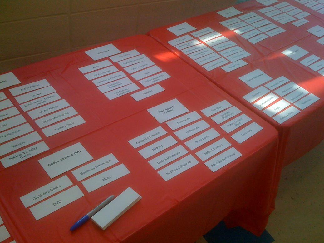
  5. Fig 3 Card Sort
     
    Figure 3: Sample Card Sort Display: Cut Index Cards on Table

  6. Prepare the Analysis. At the end of the study, there was a reference sheet with notes on each participant’s session, video of the full study, and a relatively stable final layout. With this data, it was fairly easy to identify a number of recurring themes, i.e. issues that stood out as confusing, contentious, or as a notable deviation from the original structure. As in any card sort, the results were not directly translatable to a final information structure. Rather, they provided insights that could be combined with other data (such as online sorting results) to create the final taxonomy.

Additional Resources


[1] The Delphi Research Method http://www.iit.edu/~it/delphi.html

[2] David Cooksey, Founder & Principal, saturdave, Philadelphia, PA